
Iron Smoke Distillery
Whiskey with a little rock & roll in it.
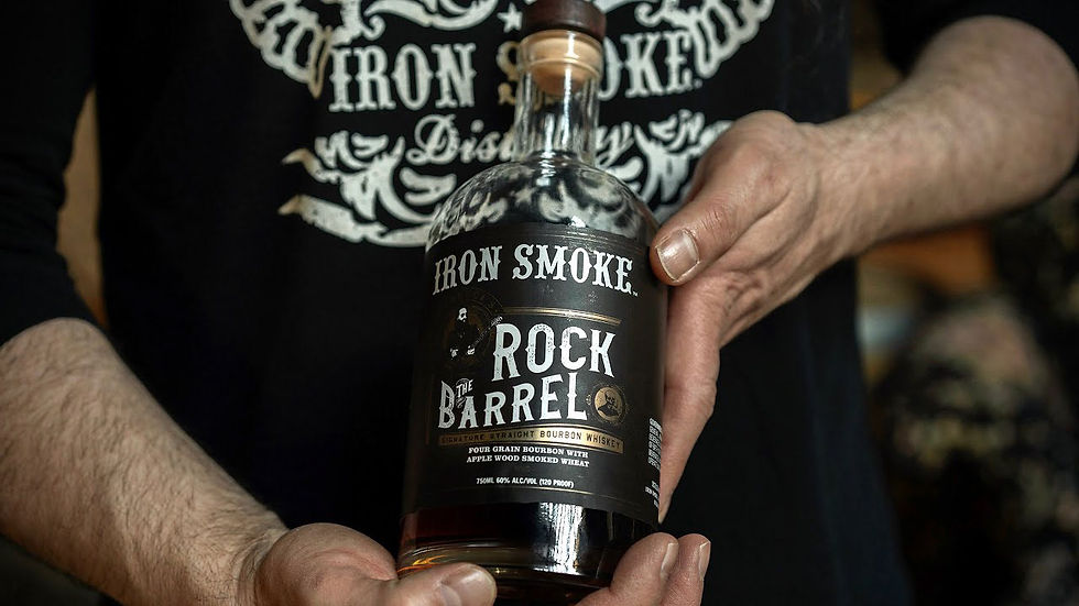
I came to Iron Smoke through music, not whiskey. I had been working as Creative Director and designer for Dream Theater and John Petrucci when John partnered with Iron Smoke to create Rock The Barrel, his signature bourbon. I designed the identity and packaging for the release, bringing the visual language of his music into Iron Smoke's world.
The collaboration worked because the connection was real. John and Iron Smoke founder Tommy Brunett shared a genuine obsession with craft, music, and whiskey, and the first release sold out in less than 18 hours. What started as one signature bottle turned into an ongoing creative relationship, and I became the creative force behind a growing portfolio of Iron Smoke releases and partnerships.
Creative Direction: Sean M. Smith
Brand Identity · Logo Design · Packaging Design · Label Design · Portfolio Development · Collaboration Design · Celebrity & Music Partnerships · Art Direction · Brand Extensions


The Brief
The assignment grew into a broad creative direction role across Iron Smoke's portfolio: developing labels, logos, and packaging for a major part of the brand's range while establishing a visual language that could stretch across new expressions, collaborations, and limited editions.
The challenge was making every bottle feel like part of the same universe without making every bottle look the same. Iron Smoke needed the credibility and craft cues of a serious whiskey brand, and it needed the personality of a brand born from music culture rather than a boardroom.
That meant building a system with enough structure to create recognition and enough attitude to let each expression have its own story.
The Idea
"Old soul. New noise."
The visual language married the ornamental richness of the gaslight era with the graphic aggression of rock posters, album art, and vintage Americana. Detailed typography, dramatic compositions, blackened textures, and period references gave the packaging a sense of history, while the attitude came straight from the music world.
It was a contemporary whiskey brand borrowing from the visual vocabulary of another era, then turning the amp up.


The Work
Creative direction extended across a substantial part of the Iron Smoke portfolio, from core whiskey expressions to specialty products and co-branded collaborations with musicians and celebrities. Each label became an opportunity to push the visual language somewhere new while keeping the overall brand unmistakable.
The work moved beyond packaging into the larger Iron Smoke experience: merchandise, promotional materials, music programming, and the physical environment of the distillery itself. Iron Smoke wasn't sponsoring music from the outside. Music was part of the brand's DNA.
That DNA has since become a literal destination. The distillery's programming now includes an extensive calendar of live rock, blues, Americana, tribute, and other music events, and its Fairport Music Festival brings multiple days of live music to the distillery.
The Outcome
Iron Smoke grew into something larger than a whiskey label. The visual language helped establish a distinctive position for the brand in a crowded spirits category, where craft coexists with irreverence, heritage coexists with rock & roll, and the bottle feels as much like a piece of culture as a piece of packaging.
The distillery now describes itself as a "Spirit Factory, Watering Room & Side Show," and its events make the intersection of whiskey and live music tangible.
