
X Games / ESPN
Defining the Visual Language of Extreme.
X Games broadcasts a culture built on skateboard decks and halfpipes, athletes who turned rebellion into a global language, and a community that lives between sport, music, and street.
When a brand operates at that intersection and reaches audiences around the world, the visual system holding it together has to work everywhere.
Executive Creative Direction: Sean M. Smith
Art Direction + Design: Sean M. Smith, Edward Taylor
Project Management: Dennis Martin
Project Management for ESPN: Chris McClure, Alex Zartman
Brand Standards & Style Guide · Broadcast / On-Air Graphics · Print & Advertising · Social & Digital · Merchandise & Apparel
One System. Every Surface. Every Market. Every Year.

The Brief
X Games already had the attitude. What it needed was a system capable of carrying that attitude across every market, medium, and moment.
Markets were interpreting the brand on their own terms, creating a global property that could look like a different brand depending on where you encountered it.
The challenge: build every major touchpoint around one visual standard that could hold across the globe.
The Idea
The brief was consistency, but the real work was conviction. The pace was frenetic, the energy relentless, and every decision had to keep up.
The pace was frenetic, the energy relentless, and every decision had to keep up.
The visual language was rebuilt around the raw energy of action sports, the credibility of youth culture, and the adrenaline of a live broadcast. The team set principles that could guide creative decisions without flattening the personality that made X Games matter in the first place.





The Direction
Over two years, the creative direction established a system designed to travel without losing its edge.
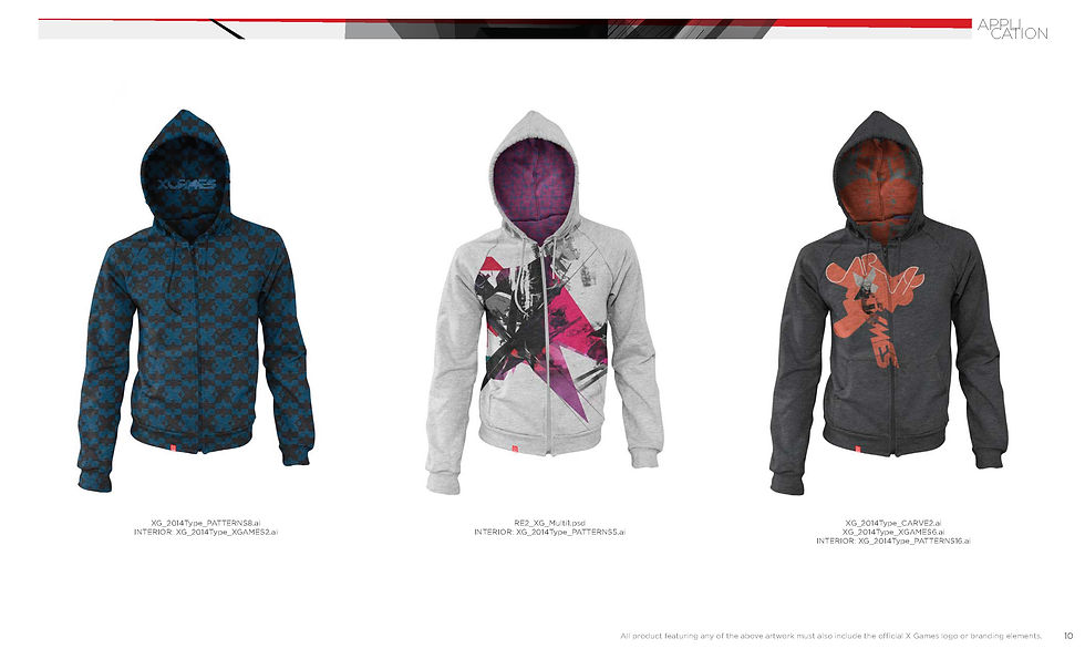
Brand standards gave designers, producers, and partners around the world a common creative framework. The system extended across print, advertising, social, digital, broadcast, on-air graphics, merchandise, and apparel.
Every application had to feel unmistakably X Games while working within the very different demands of a global, multi-platform brand.
The goal was to capture the energy of the games and make everything feel like it came from the same point of view.
The System
The visual language had to perform everywhere the brand existed: a live broadcast, a phone screen, advertising in Austin, communications in Oslo, a sponsor activation, something an athlete would actually want to wear.
That meant building rules flexible enough for local execution, but strong enough to protect the character of the brand.
The style guide worked as a creative tool as much as a rulebook, a shared language that let teams around the world make confident decisions without constantly checking back with headquarters.


The Outcome
The resulting style guide became the global creative standard for X Games.
More importantly, it became a living system used by production teams, designers, and broadcast partners around the world to create work that stayed recognizable, relevant, and distinctly X Games.